Our talk at the 2017 Personal Democracy Forum
On June 8, 2017, we gave a talk at the 2017 Personal Democracy Forum in New York City about protest trends that we've observed across the United States. We had a fantastic time sharing Count Love with others, and we were honored to meet so many wonderful and supportive members of the civic tech community. Below, we've transcribed our talk (with light edits) and included the slides that we presented. You can view an official recording here. The data in this talk reflects protests through June 5, 2017. For more recent data (updated nightly), see our searchable map and statistics pages.
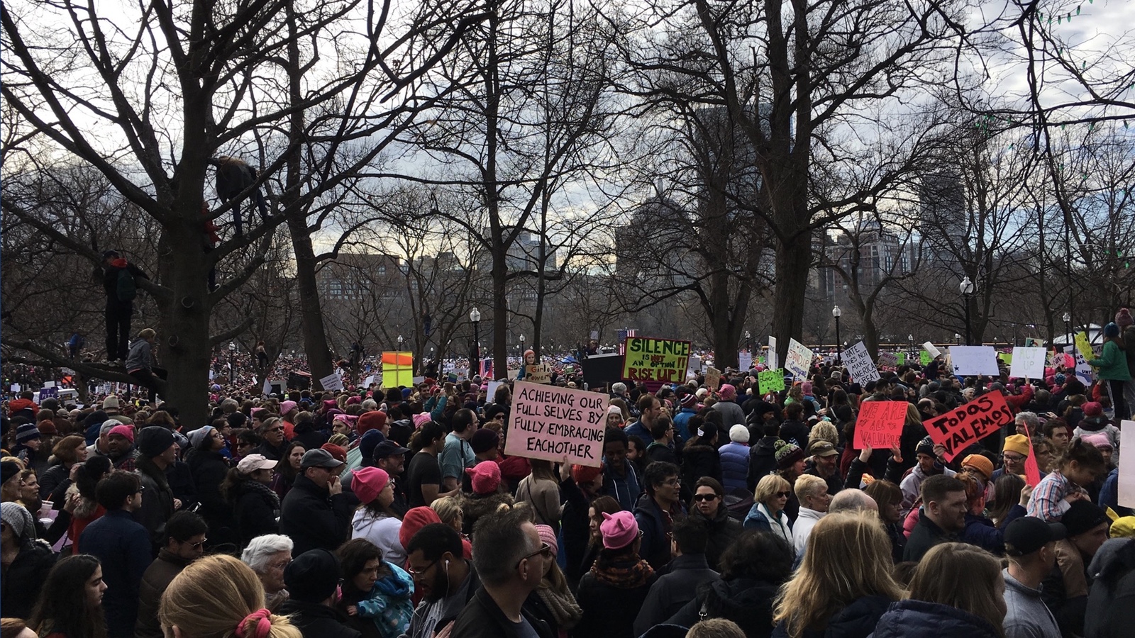
This is a photo that we took of the Women's March in Boston on January 21st. We were relieved to see that there were so many people concerned about the same issues that we were concerned about. But when we were walking home from the protest, we kept talking to each other about how ephemeral protests are. We thought, “Wouldn’t it be powerful if we had a historical record of these protests so that we could understand some of the broader trends about what people are concerned about and how also how those trends change over both geography and time?” So we went home, and we built it. We call our protest tracker Count Love, and we are counting protests against the current administration's policy agenda.
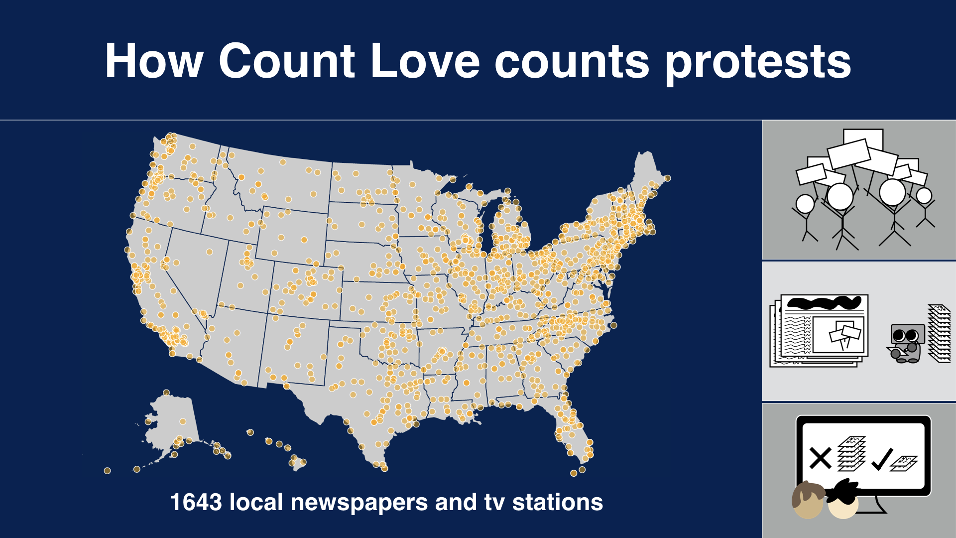
Here is how it works: We have an adorable robot—a software robot—and every night, it visits over 1,600 local newspaper and television websites, where it meticulously looks for words like “demonstration,” “rally,” and “protest.” We then collect these articles and manually read each one. When we find a protest event, we note the date that it occurred, the general topic that people were protesting about, the location and, if possible, an attendance count. We try to be fairly conservative with the attendance count. So if an article says that there are dozens of attendees, we will count that as 10; if it says "hundreds," we will count that as 100. Each night, after we finish reviewing articles, we publish the latest data on our website countlove.org. We have also built simple search and statistics tools, so that anyone can go to the site and explore the full set of data.
Now that you know a little bit about how Count Love works, we are going to share some trends that we've observed thus far in the data.
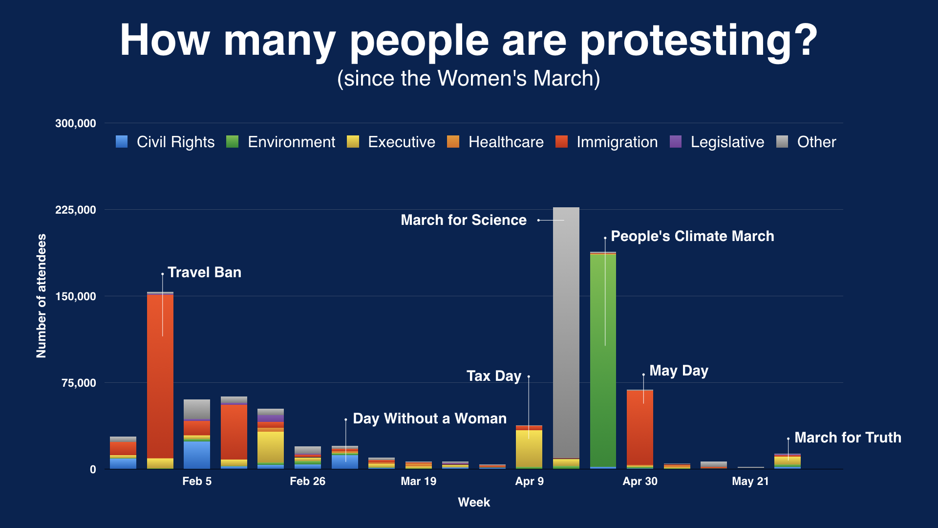
We can take this data from the time-lapse and look at it as a chart showing what brought people out to protest each week, broken down by those high-level categories previously mentioned (immigration, executive branch, etc). There have been a lot of protests that have garnered large-scale coverage and headlines—for example, the March for Science, a Day without Women. These events were nationally coordinated and brought thousands, tens of thousands, even hundreds of thousands of people out to advocate for certain policy ideas or values.
But it is also worth noting that there have been some substantial events that were not as coordinated, like the response to the first executive order on travel and immigration. These protests, which were more grassroots in nature, took many different forms—people going to the local airport to help others through immigrations and customs, or going to city hall to advocate for sanctuary city status. There wasn't a single date for the protests and there wasn't a single group organizing the response, but it still made a huge impact.
You will also see that in mid-March and mid-May, there was a big lull in the number of people that came out.
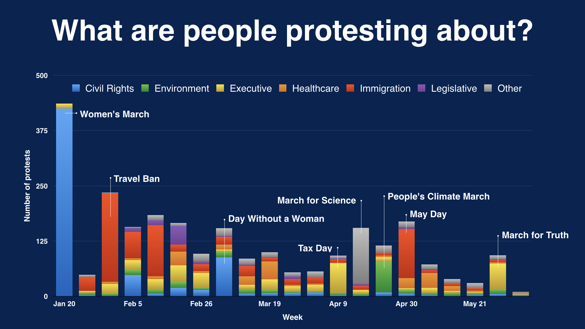
If we look at a slightly different chart (shown above) that shows not the number of protesters, but the number of events that occurred each week, we see that there were still a lot of protests going on in mid-March and mid-May. These gatherings took a different form and tended to focus on local advocacy—people who held die-ins, making their congressperson aware that they were not comfortable with the new health care bill, or people who went out to advocate for town hall meetings.
By having this comprehensive resource that lists protests and attendees, we can see trends in national headline-grabbing protests, as well as in local and regional events.
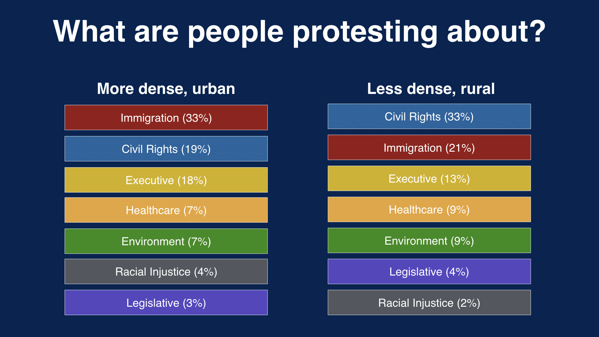
We also have geographic data for where these protests took place. We were curious to see if there are differences in what brought people out in different parts of the country. Using the density of counties, we can compare what is happening in the more dense, more urban counties and what is happening in the less dense, more rural counties; we can see if people are protesting about different things.
We were surprised to see that there is a lot of overlap in the priorities and motivations that underly protests. It is not identical; there are differences. Immigration receives a bit more attention in urban counties, while health care and the environment are the focus of a larger proportion of protests in more rural counties. But for the most part, people across the United States are coming out to protest many of the same topics and feel passionately about many of the same values.
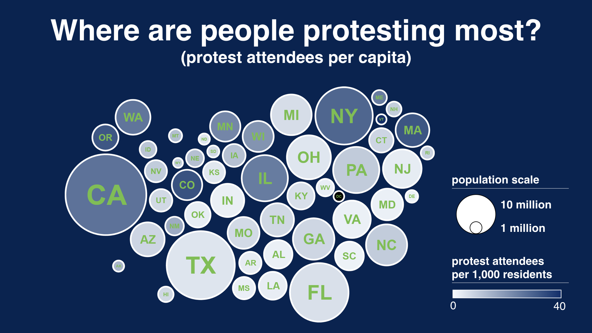
Because we have this geographic data, we can also look at a breakdown of protests per state. The image above is a cartogram, which reflects not the geography of each state, but the population size. The area of each circle is proportional to the population of the state, and the color of each circle indicates how many protesters per capita we have counted since inauguration. For example, California is a large circle, due to its large population, and is darker blue as there have been many protesters per capita; Vermont, which has a smaller population, is also dark blue as it is one of the highest number of protesters per capita. Some swing states during the last election, like Wisconsin and Minnesota, are relatively dark blue. People in these swing states are relatively active in expressing their concern about the direction of the current administration.
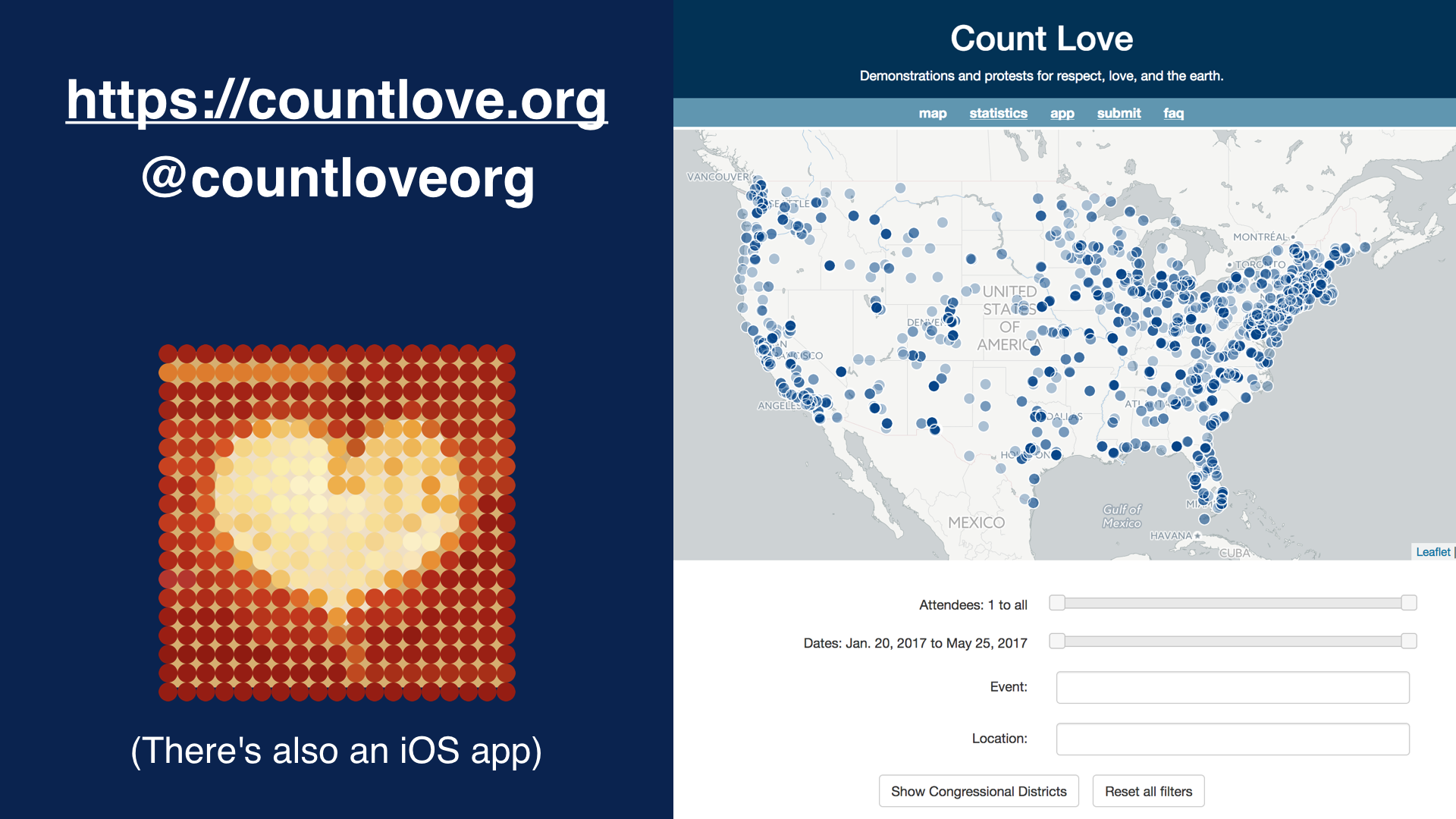
These are just some of the trends that we can explore with the data in Count Love. We continue to update the site nightly, so we encourage you to check it out at countlove.org. We will continue to share trends and data that we find on the website. We have also built a simple iOS app that allows people to submit information about an on-going protest anonymously, so that we can keep collecting information about new events that occur.
Thank you for your time.